Bloodsports # 5 – Laputa: Castle in the Sky

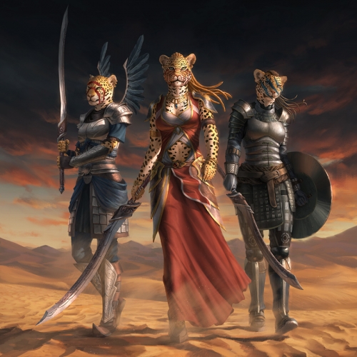
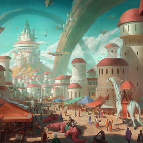
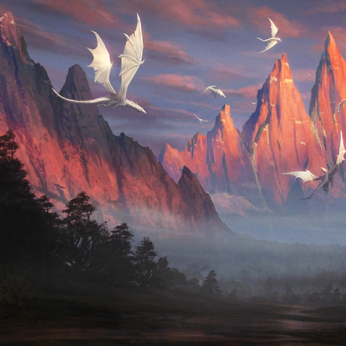
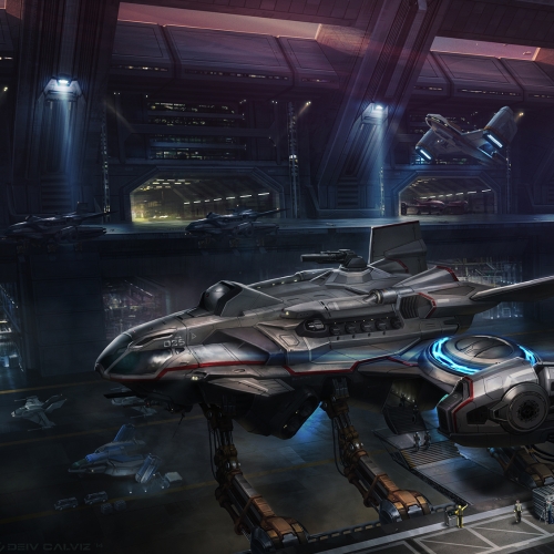
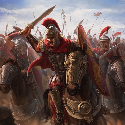
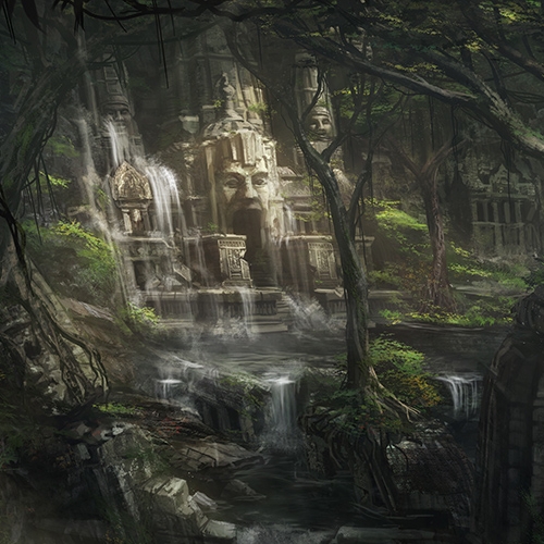
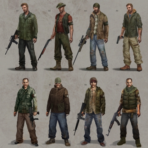
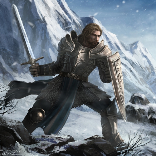
Another Crimsom Daggers Bloodsports entry, my second! I tried to go a little star wars or lord of the rings-ish with the design, meaning multiple characters all crammed up. I thought it was a good practice and doing the composition was totally out of my comfort zone. Anyway, I didn’t place but it was still awesome to do. The journey is the reward anyway. ( I just have to avoid cramming AGAIN next time. )

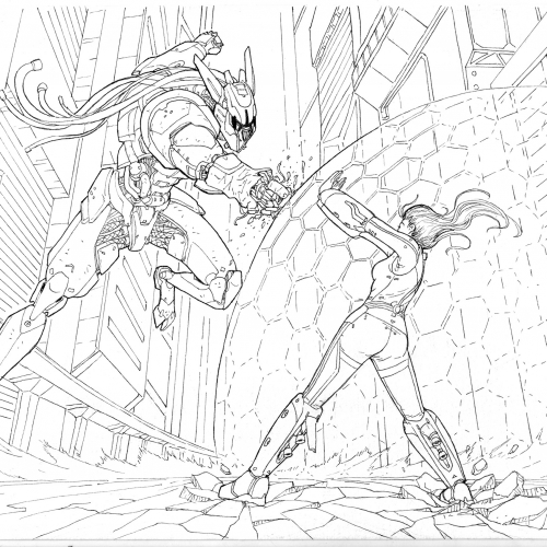
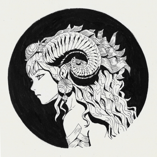
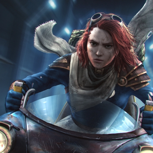
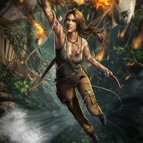
Here are the studies. I realized I need to practice more on doing linearts of the facial structure so I wouldn’t need to liquify too much. I also needed to do more hand and clothes studies… Laterdays!

Deathline goals and some polished sketches

To anybody wondering why I stopped posting for like a month, I’ve been really busy with some work here and there that I can’t really talk about.

To catch up on lost time and updates, here are a few old and recent sketches and one sorta new memory inspired painting of a random girl there at the top. (Something simple for a change.) Also, just to clarify things, I categorize my works as sketches when it’s spontaneous and unplanned with varying states of detail. While my stuff in the illustrations category are planned works with a purpose.

On another note, here are my Deathline goals. If you don’t know what it is, just go to www.crimsondaggers.com to find out.

My 365 day goals:

1.) Finish writing the script and doing at least 5 high quality pieces for my personal project.

2.) Improve my art.

  • Join bloodsports challenges.
  • Dedicate more time to do studies. (at least once a day!)
  • Optimize my work flow and brush sets.
  • Draw around 3 high fantasy pieces for future plans. (dragons, barbarians, etc.)

3.) Exercise! (at least 3 times a week with special posture correcting steps coz yeah I slouch a lot.)

This is gonna be hard…. FIGHT!

Bloodsports # 4 – Legend of Lizards

This is gonna be my first post of the year instead. I finally gave the Crimson Daggers’ Bloodsports challenge a shot. Although I didn’t have enough time to do it, I really enjoyed doing something different.

The entries for this challenge blew me away! 100+ people submitted with lots of great stuff! You guys could check them out in the new Crimson Daggers Forum. I didn’t really place in it but it’s mostly my fault too of not preparing enough. Please don’t do what I did of not really exploring more compositions or not thinking more about the back story of the character. Looking forward to the next one!

Also, BIG THANKS to Dave RapozaDan Warren, and everyone else for keeping the community alive. It really helps me/us get motivated to do stuff and push ourselves.

Laters!

Dr. Sketchy’s Anti-Art School Manila!!

Had my first Dr. Sketchy’s alternative figure drawing last friday at Spidersilk Production’s TECHNOTEAPOT exhibit. Although, I didn’t prepare at all and my works suck, it was still an awesome event!

I decided then to attend the next session which was last monday at their original venue this time.

I did this environment sketch while waiting for the event to start. Apparently, we where the first to arrive. (Thanks for the pizza, Tessa!)

Above are some 5-10minute sketches. These are definitely better than during my first try.. lol. The rest below are like 10-20minutes each. I only focus on the gesture, pose, silhoette or whatever you’d call it not minding my crappy technique or lack of one.

Coming from somebody without much of a traditional background, I’d definitely recommend this event to anyone who’d like to go back to basics and try figure drawing in a different kind of set up. Looking forward to the next drawing jam!

Oh, and here’s some random Rey Bustos. Cheers!

Abaddon and Venom – Painting Process

Kinda late post. I had it up on the tube for quite a while already before this post. Anyway, I’d be continuing doing these process videos for personal pieces for as long as I can. This is my only way of tracking my progress while giving back to the art community so hopefully other people could get something from it.

This venom fan art was based on allentotingski.deviantart.com ‘s unfinished sketch. Didn’t put the logo at the chest coz it’s too distracting for me.

*************************************************************************
Here are a few relevant tips for digipainting stuff like this:

-As Brad Rigney would have it, I used color dodge, textured brushes, smudge tool, and accented edges to make this image. I used accented edges to darken edges to make details feel like they’re really embossed. I do this on a duplicate layer then I erase the parts where the effect looks bad.

– Flipping the canvas horizontal is already a common practice to check for mistakes but this time, flipping vertically proved to be very useful especially for hands.

-Be careful of specular highlights. Try to simplify forms into simpler shapes like spheres and cylinders before you decide on where to put the highlights.

-Rim lights again to save your ass!

*************************************************************************

Did this venom fanart one day in around 6hrs.

I decided to make this image for practice and as a new portfolio piece just because I am a huge fan of the concept artists at Blizzard Entertainment. I think I got inspired by their rough monster concepts for Diablo 3.

I just wanted to redesign a typical demon with a trident.

*************************************************************************

Here are a few relevant tips for digipainting stuff like this:

– Creating a reference Sphere can help you keep a consistent palette and lighting for your subject.

-Lighting an external scene as if it was in a studio can help to create interesting moods.

-As usual, nail the lighting and palette as early as you can. I find that using the “replace color” feature is extremely helpful in the earlier stages to set the lighting. All the details can change later on. Once you’ve done this, it would be easier to zoom in for the details without losing the lighting you’ve set.

-Exaggerate depth by putting fog and particles. Our brains are trained to view things that are faded as being farther away. I exaggerated this technique on the tail and the farther limbs to give depth.

*************************************************************************

Thanks for watching!

Did this one in around 13hrs. (lol at the number) Next real update in a few minutes.

Monsters and Pointy Rocks

Hey guys! ..It’s been a while… again. So, as promised I applied some of the stuff I learned about anatomy on these illustrations. Yep, not a sketch or speed paint but illustrations!

Anyway, I decided to make this image for practice and as a new portfolio piece just because I am a huge fan of the concept artists at Blizzard Entertainment. I think I got inspired by their rough monster concepts for Diablo 3. My goal in this image was to design a demon boss while maintaining a few iconic elements for a demon such as the two horns, the trident, and the tail. I tried to keep the silhouette simple and readable ( with LOTSA DETAILS! ) and since this was only a personal challenge. ( Don’t mind the crappy composition or the crappy pose. haha ) I also focused on the different shades and hues near red to practice getting sensitive with values and hues.

This venom fan art below was based on Allen Geneta’s unfinished sketch. I’ve just learned a few techniques that Brad Rigney uses like the smudge tool, and the Accented Edges combo so I practiced on this sketch.

I also recorded my paintings as usual so watch out for the new tips and the new videos soon! Cheers!